Terra
Edgesoft Website
UX RESEARCH
VISUAL DESIGN
21 OCT-16 DEC 2021
This project was done for a AI/ML company that provides customised AI/ML solutions & Network services geared towards automation of processes & systems in various industries.
Being the sole designer, I led the team with user research and wireframing stages for this project. The overall aim was to build a website for the company with a seamless user experience and user interface to convey the companys offerings efficiently through research and insights from stakeholders, directors, and developers.
Being the sole designer, I led the team with user research and wireframing stages for this project. The overall aim was to build a website for the company with a seamless user experience and user interface to convey the companys offerings efficiently through research and insights from stakeholders, directors, and developers.
Brief:
TerraEdgeSoft needed to enhance its user experience to gain traction and attract more clients. This was a great opportunity to give the company a definitive visual design and establish trust.
This project was high priority with different needs from various stakeholders and directors. Even though it was challenging to prioritize each individual and their needs, the outcome was successful in
Aim:
- Develop a user-friendly webflow to introduce the offerings of the company and allow clients to book a session.
- Enhance the websites user experience and user interface to provide a more engaging experience.
- Have the new website serve as a kickstart to the new visual design system for TerraEdgeSoft.
DISCOVERY:
To further understand more and as a first step, I did individual and group interviews with various stakeholders and directors directly involved with this project. These individuals were from diverse departments within the company, such as Directors, Sales, Marketing, and Development. These interviews helped us to know individual needs and their expectations from this project.
Insights from interviews
- Clients/Customers:
- Needs: Easy navigation, clear information about services, seamless booking process.
- Insights: Value a classic and visually appealing website, prioritize efficiency in finding information.
- Needs: Easy navigation, clear information about services, seamless booking process.
- TerraEdgeSoft Directors:
- Needs: Increased client engagement, positive brand perception, alignment with the company's vision.
- Insights: Interested in measurable metrics like increased bookings and improved user satisfaction.
- Needs: Increased client engagement, positive brand perception, alignment with the company's vision.
- Sales Team:
- Needs: A user-friendly platform that highlights key offerings, supports lead generation, and encourages conversions.
- Insights: Interested in a streamlined process that leads to increased client inquiries and conversions.
- Needs: A user-friendly platform that highlights key offerings, supports lead generation, and encourages conversions.
- Developers/IT Team:
- Needs: A platform that is technically sound, scalable, and easy to maintain.
- Insights: Prioritize a robust and secure architecture, seamless integration with other systems.
- Clients/Customers:
- Alexandra
Works in a managerial role in a large corporation. - Needs:
- Easily accessible information about TerraEdgeSoft services.
- Smooth booking process for corporate training sessions.
- Assurance of data security and privacy.
- Insights:
- Prefers a professional and clean design.
-Values quick access to relevant information.
2. Carlos
Owns a small business focused on technology solutions.
- Needs:
- Clear understanding of TerraEdgeSoft's offerings.
- Easy communication channels for inquiries.
- Scalable solutions for potential future collaborations.
- Insights:
- Appreciates a visually appealing design that conveys innovation.
- Values a user-friendly interface for quick decision-making.
Additional Insights:
- Integration with CRM: Seamless integration with the customer relationship management system for better client management.
- Accessibility: Ensure the website is accessible to users with
disabilities, meeting accessibility standards.
- Scalability: Design the platform to accommodate future enhancements and additions to the service offerings.
Usability testing
For the usability testing, we gave specific tasks to each participant to understand their thinking of the website. We also did usability testing with the redesigned website for validating the design and assuring the user flow.
Findings
- Design choices frustrate the users - font size, font color, white space, all caps and illegible fonts.
- For booking a call, a clear call to action is necessary.
- Users are also interested in secondary information such as previous case studies, etc to build trust.
Card sorting
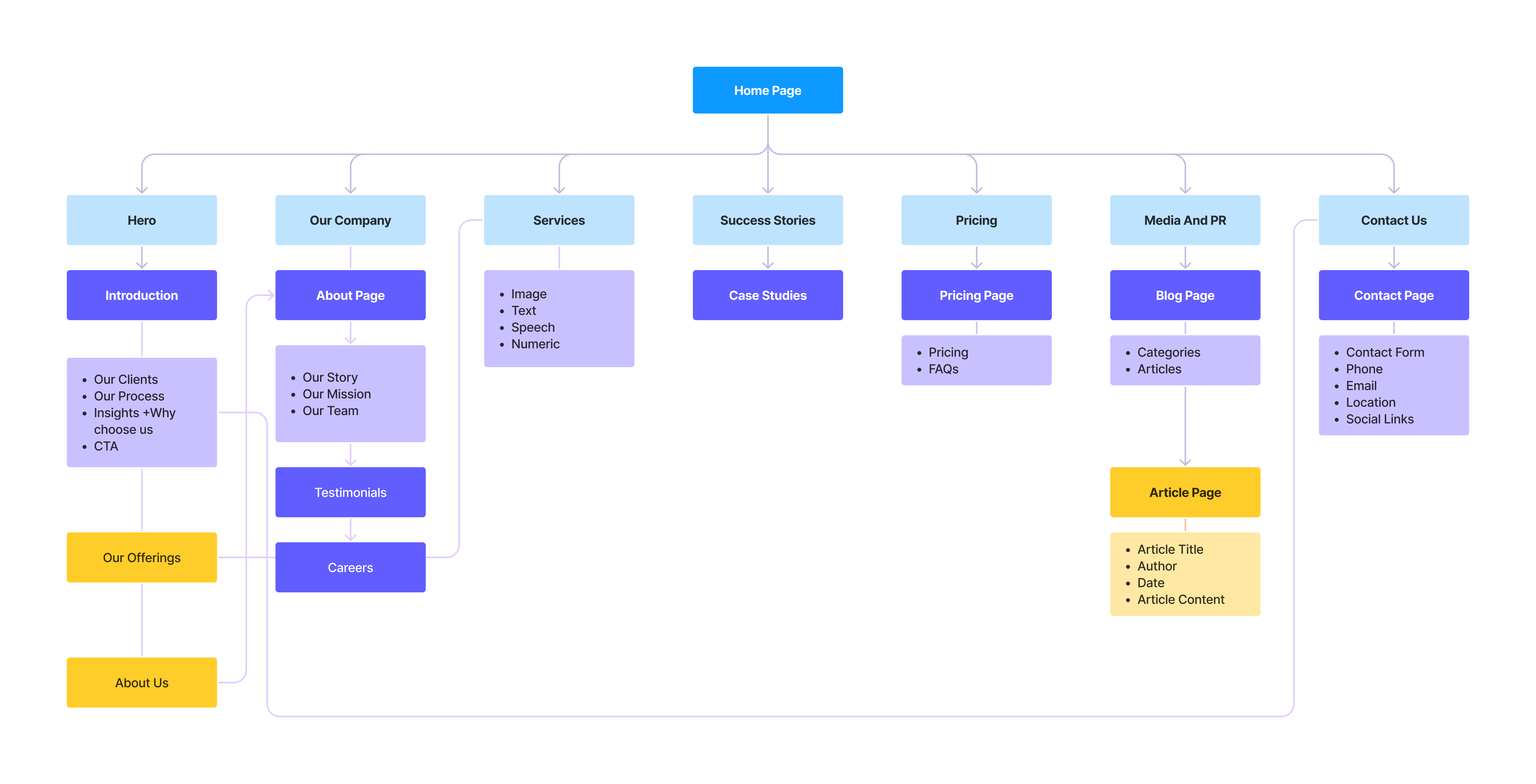
We did card sorting with our participants to understand the information architecture of the current website. Card Sorting was exclusively for the navigation as there were many opportunities to improve the structure. This exercise also guided us in grouping content for the mega navigation during the redesign.
Findings
- Most users thought that TerraEdgeSoft could remove many unnecessary contents within the mega navigation.
- There were also content that the users were not aware of and needed clarification.
Information Architechture:
Aim:
- Develop a user-friendly webflow to introduce the offerings of TerraEdgeSoft and facilitate client bookings.
- Provide Access to Secondary Information: Ensure easy access to secondary information like case studies to build trust and provide comprehensive insights into the company's offerings.
- Streamline Navigation Structure: Revise the website's navigation structure to remove unnecessary content, clarify existing categories, and improve overall user navigation experience.
Findings:
- Navigation Simplification: Based on card sorting findings, streamline the website navigation to remove unnecessary content and improve clarity.
- Accessibility Considerations: Ensure compliance with accessibility standards to cater to users with disabilities.
- Content Organization: Provide clear and concise information about TerraEdgeSoft's services, while also including secondary information such as case studies for building trust
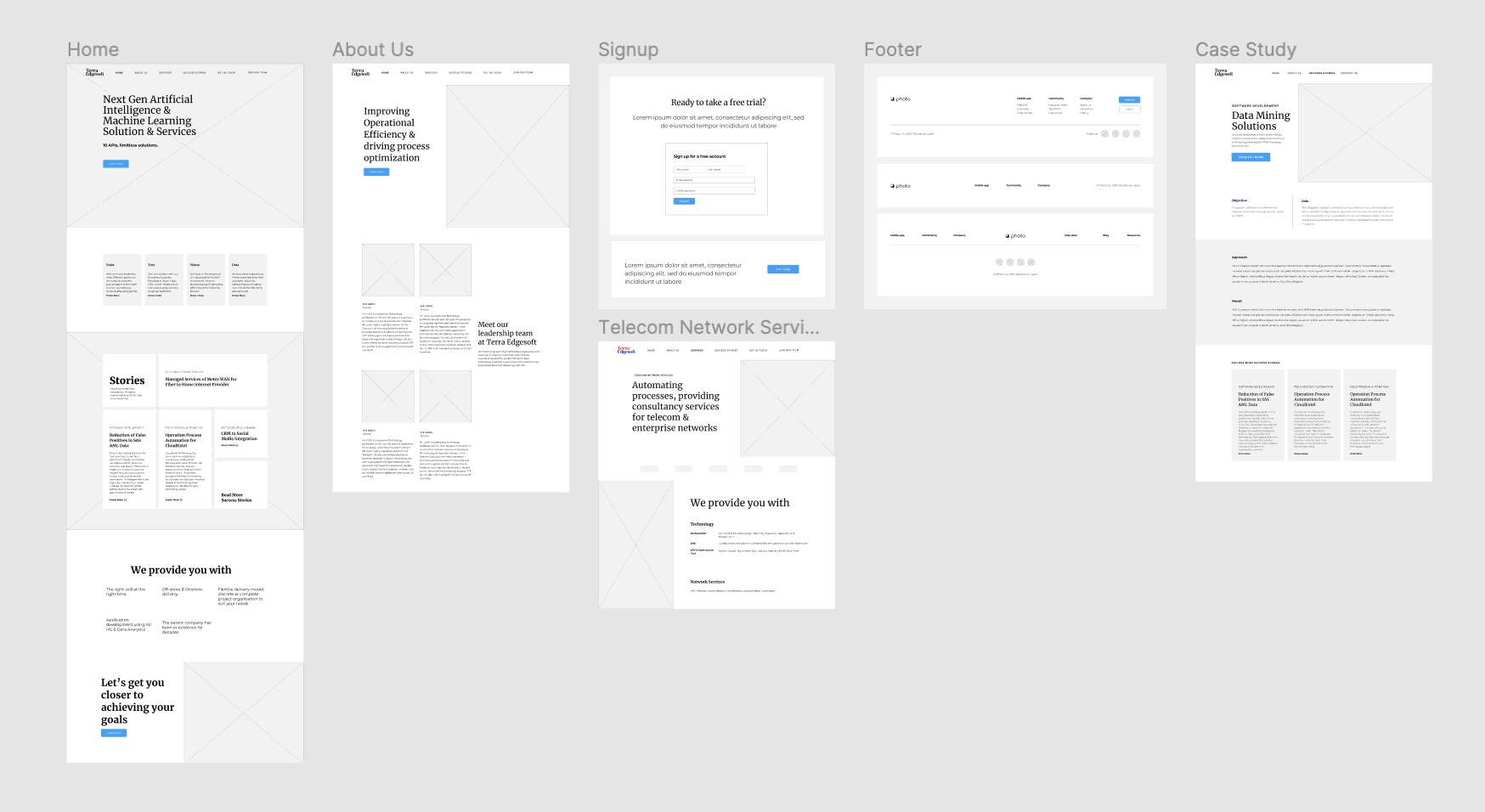
 Wireframes:
 These wireframes will serve as the foundation for the development of user-centric interfaces that effectively communicate complex AI functionalities, enhance user experience, and streamline interaction with AI-powered products and services.
Through meticulous design and consideration of user needs.
Our Aim:
- Craft wireframes that facilitate seamless navigation.
- Promote clarity in information presentation, and foster engagement. Ultimately contributing to the company's mission of delivering innovative AI solutions that resonate with its target audience.

The Final Design:

Design system

Color Palatte:
Bright cobalt blue is the dominating color for the whole website as it evokes a sense of honesty and trust in the user’s mind. The primary buttons are blue so that they could stand out from the secondary buttons.
Accesibility:
Contrast is the difference in brightness between any two elements. The Web Content Acessibility Guidelines (WCAG) set specific ratios that achieve the minimum required contrast for legibility. Generally speaking, small text is any size below 24px and requires a 4.5:1 contrast ratio. Large text is anything above 24px and requires a 3:1 contrast ratio.
